Challenge
Is it Ancora Burgundy though?
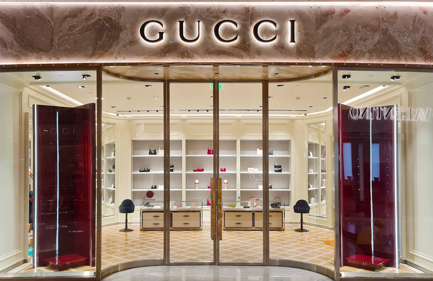
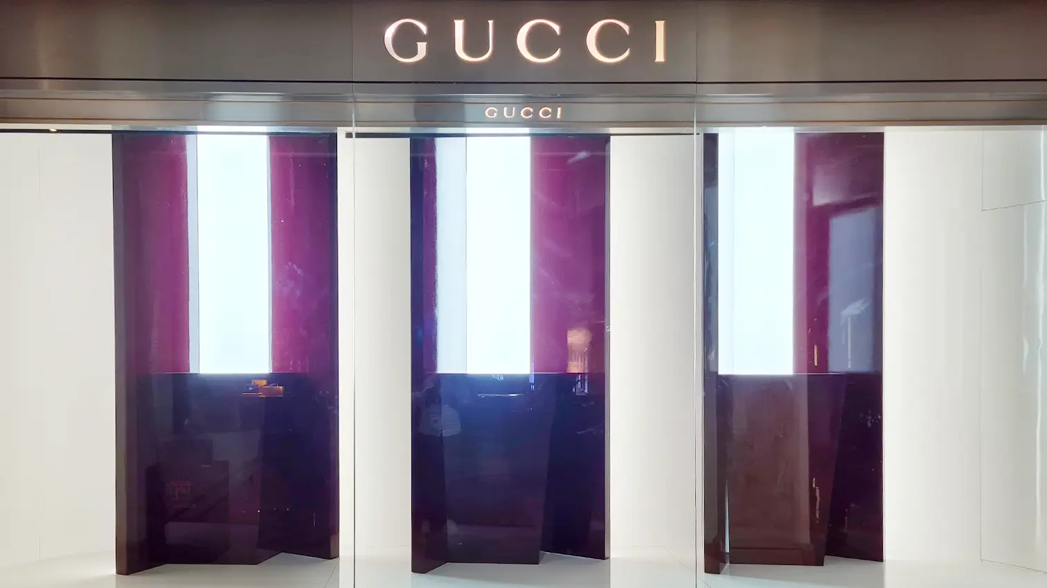
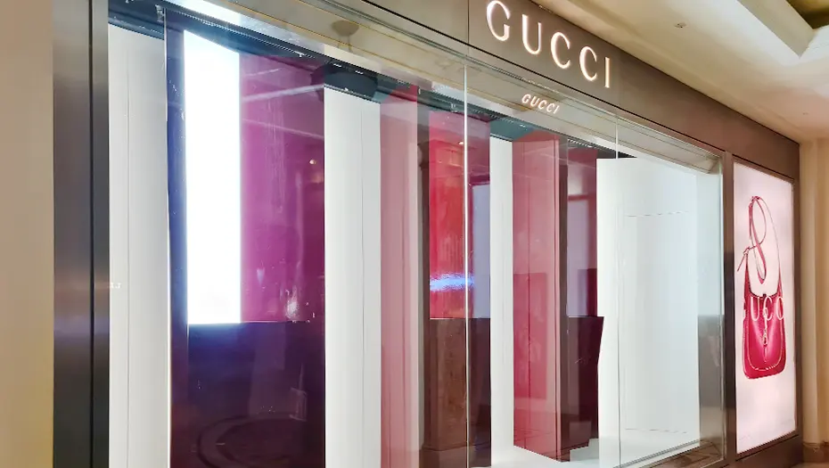
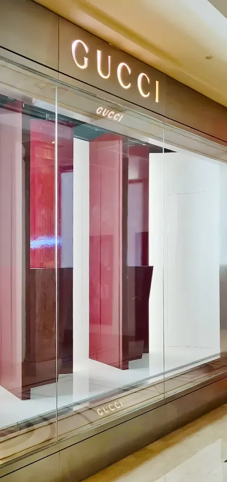
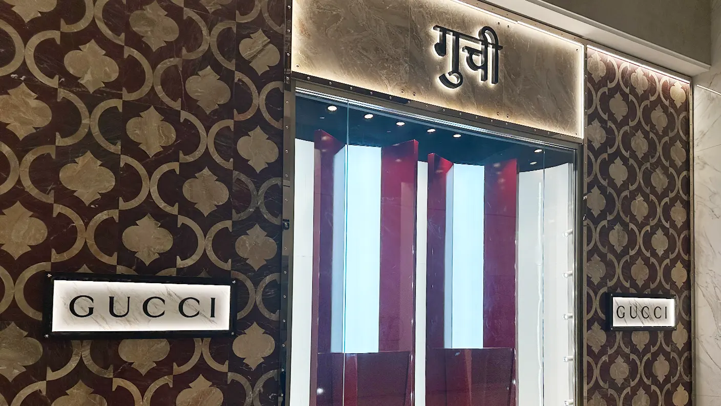
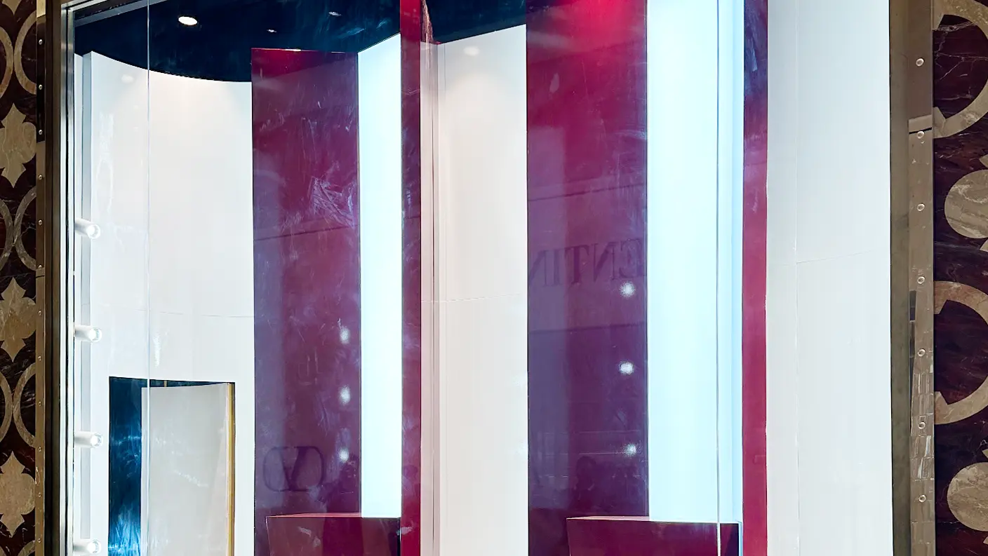
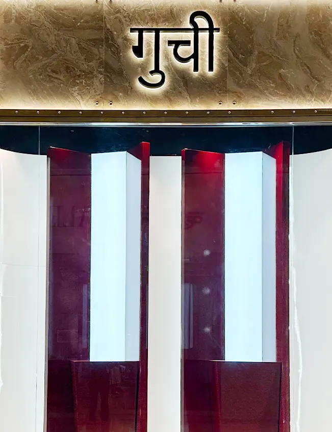
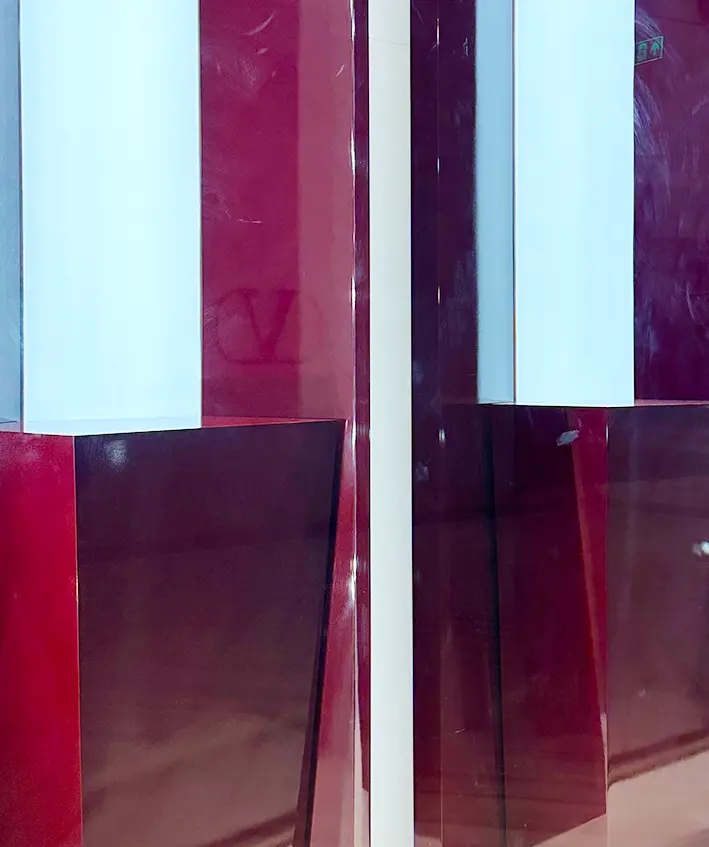
Even our extensive recce didn’t predict the curveball of a slanted floor in one of the stores. Apart from this, a complete in-house production meant the elaborate and rewarding expedition to perfection. Which meant colour matching the Gucci Burgundy for all window displays and mannequin pop ins.
Approach
89 is not 90.
When it comes to retail store experiences, the smallest error sticks out like a sore thumb. The slightest tilt in the floor would mean an entirely, and more importantly noticeably tilted window display. We had to make sure all our angles were right, lines were straight and colours were matched.
Solution
The beginning of a new legacy.
The change at the Gucci helm was felt in worldwide fashion circuits and was bound to reflect through their stores. The Ancora collection was De Sarno’s nod to the Gucci legacy as a sign of respect before carving out his own path. The archival campaign also saw the revival of “five icons from a bygone era” in an exhibition conceived by architect Guillermo Santomà. These included a vase, couch, rug, lounge chair and cabinet. Any guesses what colour they were?


