


18 January, 2025
Love at First Sight: How to Pick the Perfect Valentine’s Day Colour Palette
Love at First Sight: How to Pick the Perfect Valentine’s Day Colour Palette
Valentine's Day isn’t just hearts and flowers - it’s an opportunity to spark emotions and create unforgettable experiences. As a retailer, your window display is the first thing passersby will notice, and it needs to make an impact. The right Valentine’s Day colour palette can turn an ordinary storefront into a captivating story, drawing customers in and making them feel something deeper than just a simple purchase.
Here, we’ll explore how choosing the right Valentine’s Day colour scheme can elevate your window display from attractive to irresistible. Whether you’re aiming to evoke passion, romance, or playfulness, we’ll walk you through the emotional power of colours and show you how to align your display with your brand and audience.
The Psychology of Valentine’s Day Colours
When it comes to Valentine’s Day, colours do more than look pretty; they communicate emotions and set the mood. Think of red, pink, and white as the holy trinity of this holiday.
Red embodies passion and love, evoking strong feelings of desire and connection. It’s bold, it’s fiery, and it screams, ‘Look at me!’
Pink, on the other hand, is softer and more romantic. It whispers sweetness and tenderness, making it perfect for capturing hearts more gently.
White? It’s the underdog that often ties everything together, symbolising purity and simplicity. It balances the intensity of red and the playfulness of pink, giving your display a refined touch.
But times are changing, and so are Valentine’s Day colour trends. Modern palettes are pushing beyond the traditional trio. Purple is making its mark as a colour of mystery and sophistication, while gold exudes luxury. Pastels, from mint green to baby blue, offer a fresh, playful twist for those looking to break the mould. These additions allow brands to tailor their displays to different audiences and create something truly memorable.
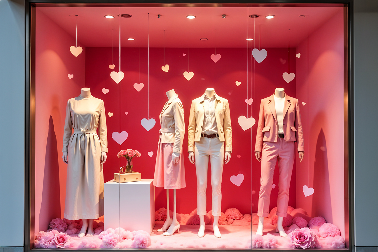
Top Valentine’s Day Colour Palette for Window Displays
Sweetheart Bliss
Imagine a dreamy blend of blush pink, soft lavender, and creamy white. This Valentine’s Day colour palette is for those who want to channel delicate romance. It feels light and airy, perfect for stores catering to a younger, whimsical audience. Think fairy tale vibes, where love is sweet, and everything feels like cotton candy. Pairing these hues with soft textures like chiffon or lace can elevate the display, creating a storybook romance.Romantic Sunset
Inspired by nature’s most poetic moments, this Valentine’s Day colour scheme combines rich reds, warm oranges, and golden yellows. It’s bold, vibrant, and a bit unexpected for Valentine’s Day, making it a showstopper for brands that want to stand out. The fiery tones of this scheme evoke a sense of warmth and passion, perfect for enticing couples looking to celebrate their fiery connection. Adding a touch of metallic gold will ground the palette and introduce a sense of luxury.Enchanted Rose
This palette leans into elegance with deep burgundy, dusty rose, and champagne. It’s the epitome of sophistication, ideal for luxury brands aiming to create an upscale atmosphere. These colours suggest timeless romance, evoking images of grand gestures and candlelit dinners. To enhance the effect, using opulent materials like velvet and crystal in your display is recommended.Love Potion
For the adventurous at heart, this palette combines hot pink, electric purple, and shimmering silver. It’s playful, energetic, and unapologetically bold. Perfect for trendy, youthful brands, this Valentine’s Day colour scheme is all about catching the eye and keeping the energy high. Adding neon lights or holographic accents will take the display to the next level of modern chic.Things to Consider Before Choosing Your Valentine’s Day Colour Palette
Understanding the Emotion You Want to Evoke
At the heart of every great display is a clear emotional message. If you want to evoke passion, go for the fiery intensity of red. To communicate sweetness and romance, pink is your best friend. If purity and elegance are more aligned with your brand, white and gold can create a serene yet luxurious vibe. Remember, your Valentine’s Day colour palette sets the tone for how customers feel when they see your display.Aligning with Your Brand’s Identity
Your Valentine’s Day window display should feel like an extension of your brand. Luxury brands often gravitate toward rich tones like burgundy and gold, emphasising opulence. Trending brands might opt for pastels or bright, playful hues to match their fun-loving audience. Eco-conscious brands can incorporate earthy tones alongside Valentine's staples like red and pink, creating a display that feels both heartfelt and sustainable. The key is to stay authentic while embracing the spirit of the holiday.Knowing Your Target Audience
Your audience determines the success of your display. Are you appealing to couples looking for a romantic night out? Stick to classic combinations of red, pink, and white. If your target is gift shoppers searching for something unique, bold pairings like hot pink and gold can help you stand out. For those catering to high-end clientele, rich tones like champagne and deep reds are the way to go. Tailoring your Valentine’s Day colour palette ensures that your display resonates with the right people.Conclusion
Selecting the right Valentine’s Day colour scheme is more than just a design choice - it’s a key element in crafting a memorable and successful window display. A well-thought-out palette not only grabs attention but also evokes the emotions you want your customers to feel.
Whether you’re aiming for romance, playfulness, or luxury, your colour choices will help set the tone for the entire shopping experience. By aligning your colour scheme with your brand identity and understanding your target audience, you can create a display that resonates and draws customers in.
If you’re ready to elevate your display, contact your agency for professional visual merchandising services. It’s time to turn your vision into reality and make this Valentine’s Day one to remember - for your customers and your business.